I Made 'Good Design' Confirmable
I’ve been building a side project, and like every side project it needed a website. So I made one. And it was bad.
Not broken-bad. Worse: forgettable-bad. It had the exact look every AI spits out when you ask for a “clean, modern” site: near-black background, one neon-green accent, three identical feature cards in a row, an eyebrow label over every section, a monospace logo trying to look technical. It worked fine. It also looked like a thousand other pages, and every time I opened it I felt a small flinch and closed the tab.
The real problem wasn’t the colors. It was that “make it look better” is a terrible goal. It’s the same trap I wrote about with New Year’s resolutions: not aligned, not confirmable, not time-bound. “Better” has no edge. You can push pixels around forever and never actually know if you’ve arrived.
So this time I tried something different. Instead of chasing “better,” I turned good design into a number I could measure, and then chase.
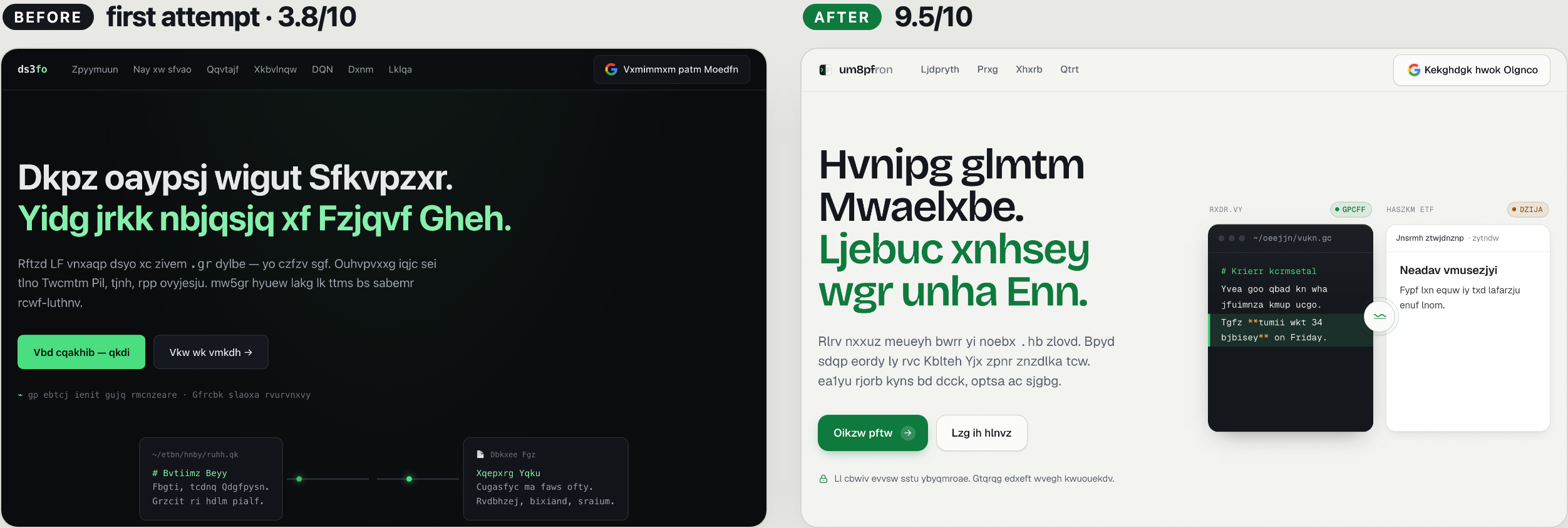
(Same landing page, first attempt on the left and the final on the right. I’ve jumbled the actual words on purpose; the point here is the craft, not the copy.)
Getting a score I trusted
I sat down with Claude Code, but I didn’t ask it to “make it pretty.” I handed it a stack of opinionated design skills and gave it a job: grade what I had, commit to a direction, and then keep grading its own work until it hit a bar I set.
The audit came from redesign-skill, one of the pieces in the taste-skill collection. It scored my site across six dimensions: distinctiveness, typography, color, hierarchy, motion, and craft. My first attempt came back at 3.8 out of 10, with a blunt, itemized list of every generic pattern it was leaning on. It stung, but it was fair, and more importantly it was specific. I finally had a number, and a list of exactly why it was low.
That was the whole unlock. “Good design” had quietly become confirmable.
The skills, and what each one was for
What surprised me is that the skills weren’t magic paintbrushes. They were opinions and rubrics, each good at one narrow thing:
- taste-skill was the rater and the enhancer, and it’s really a small family of skills. The shared six-dimension rubric is what turned “better” into a number and kept me honest every round. Its redesign-skill ran the audit-first pass that handed me the brutal 3.8, and its soft-skill added the calmer, expensive feel: the whitespace, the softer contrast, the sense of real depth.
- impeccable scrubbed off the “AI smell.” It comes with a craft floor and a little detector that mechanically flags the tells, and it’s the thing that caught my eyebrow labels and my emoji-as-icons and made me earn every element.
- Emil Kowalski’s design engineering skill owned motion, with one rule I kept coming back to: an animation has to explain something, not just wiggle.
- Anthropic’s shipped frontend-design skill forced an actual point of view. It named the obvious AI defaults out loud and refused to use them, then committed to a single, distinctive direction instead of the safe one.
Each one closed off a lazy default and replaced it with a decision I could defend.
The loop that actually did the work
The first honest redesign scored around 8.7. Good. But now I’d seen the ceiling and I wanted it, so I leaned on the part I didn’t expect to matter most: the rate, build, re-rate loop.
Instead of guessing what to improve, I asked the rater where the points were hiding, and it told me plainly. Motion was the weakest, at a 7.0. Craft was next. So I didn’t fuss over the things already scoring high. I fixed exactly the two dimensions it flagged, rebuilt, and asked it to score again. That pass landed around 9.4.
For the last stretch I basically used the agent’s own critique as a to-do list. It said, in its words, that two specific dimensions were the “anchors” keeping it under a clean 9.5, so the final pass was precisely those two, and nothing else. 3.8, then 8.7, then 9.5. Three numbers, each one earned by fixing the thing the previous score pointed at.
What I’m taking from this
The lesson wasn’t “AI can design.” It was the same lesson as my goals post: the number came first, and the number came from a standard I trusted. Once I had a rubric and a set of strong opinions, “improve the design” stopped being a vibe and became a sequence of small, confirmable moves: raise this score by fixing that specific thing, over and over, until there was nothing left to raise.
Aligned, confirmable, time-bound. It turns out design is a goal like any other. It just needed a definition before it could get better. My first attempt didn’t fail because I have no taste. It failed because I never told myself what “good” meant.